When it comes to finding the best interior designer websites in Ottawa, elegance, functionality, and user experience take center stage. These websites not only showcase beautiful portfolios but also make navigation a breeze for every visitor, whether you’re a potential client looking for inspiration or a professional seeking collaboration. In this blog, we’ll explore some of Ottawa’s top-rated interior design websites that combine modern design aesthetics with simplicity and functionality, ensuring an enjoyable and inspiring online experience.
Salina Maria Home stands out in Ottawa’s interior design scene with its sleek, user-friendly website. The modern design combines minimalism and functionality, making it easy for visitors to navigate and explore. Its simple, intuitive layout allows quick access to a stunning portfolio of high-quality images that showcase diverse and vibrant interiors.
Whether you’re seeking design inspiration or professional collaboration, Salina Maria Home’s website is your go-to for elegance and ease in interior design. Visit us and experience the perfect blend of beauty and simplicity.

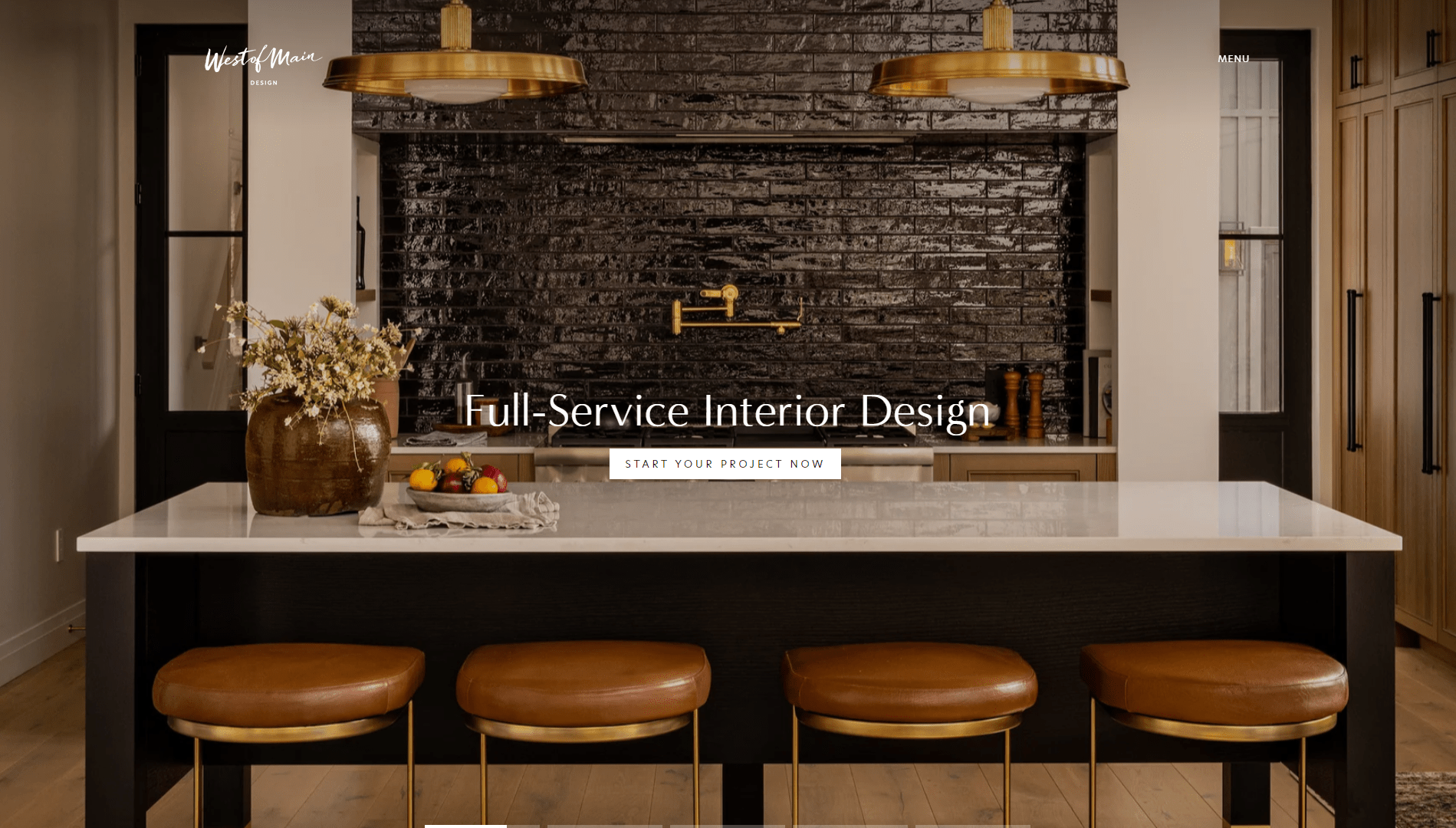
West of Main Interior Design stands out as a pinnacle of streamlined elegance in Ottawa’s design landscape. By masterfully tucking away secondary pages in their menu, their website maintains a clean and uncluttered landing page, inviting visitors to an undistracted exploration of their design philosophy.
Additionally, West of Main features a simplistic yet sophisticated shop section integrated directly into the site, offering a seamless transition from inspiration to acquisition. This thoughtful design approach ensures a user-friendly experience, emphasizing accessibility and aesthetic harmony right from the first click.

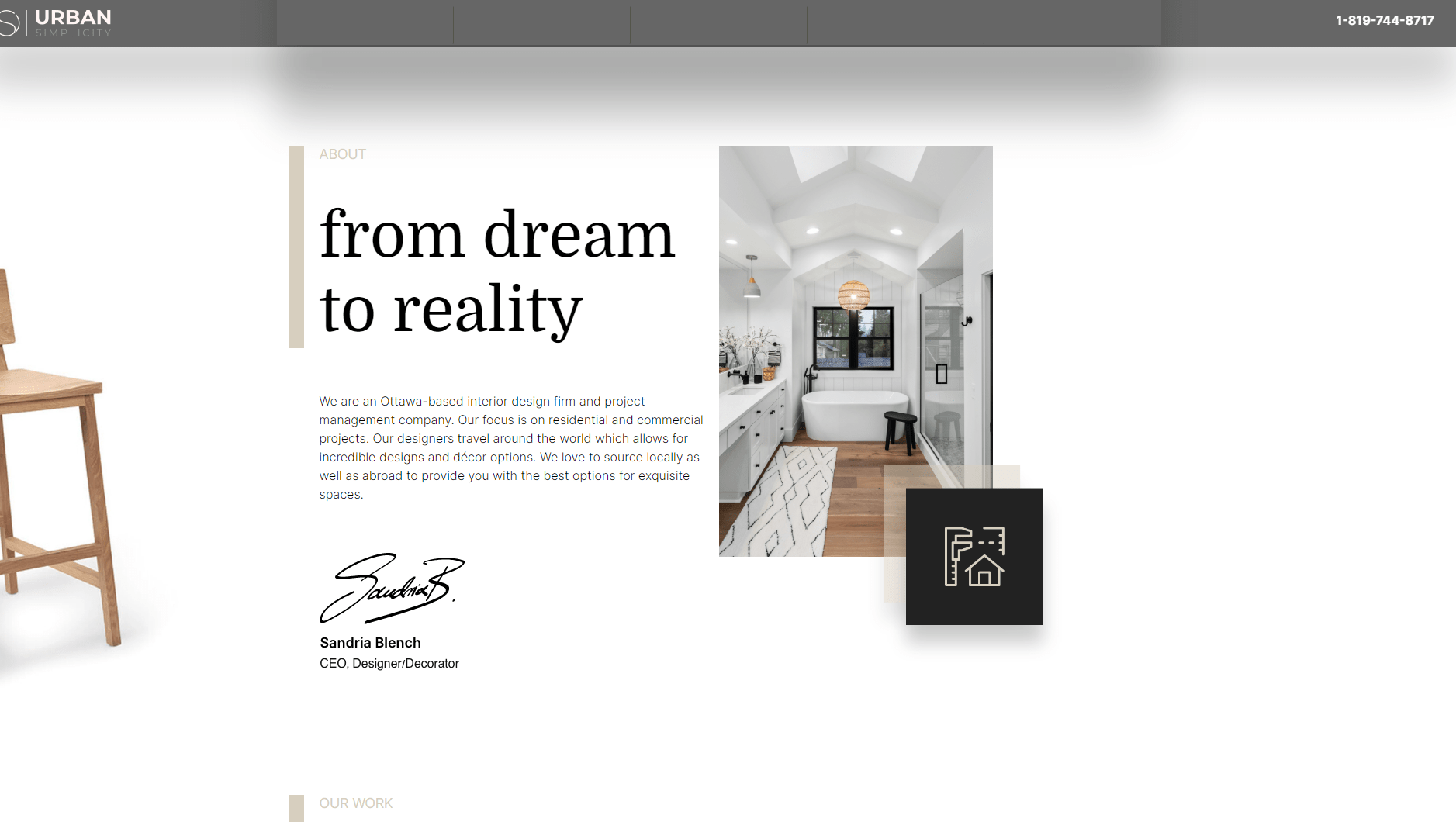
Urban Simplicity takes a bold approach to web design with its strategic use of large text blocks that make information readily accessible and easy to digest.
Their website features a smooth flow, ensuring that as visitors scroll, they experience a coherent journey through the brand’s services, philosophy, and portfolio. This design choice not only enhances readability but also engages users, keeping them interested and informed as they navigate through the site.
Urban Simplicity’s website exemplifies how effective typography and layout can guide visitors effortlessly, making it a standout among Ottawa’s interior design scenes.

Studio853 excels in creating a captivating online presence with its meticulous use of space and a clean monochromatic theme that elegantly frames their projects.
The website’s spacious layout allows each design element to breathe, drawing attention to the vivid details of their work. This monochromatic approach not only enhances the visual impact of their portfolio but also ensures that the colorful designs truly pop against a subdued background.
Studio853’s website is a masterclass in how space and color can be leveraged to highlight artistic brilliance, making it a standout destination for those seeking interior design inspiration in Ottawa.

Kari Design and Build’s website offers an immersive experience with its unique interactable effects that captivate and retain viewer attention. As you navigate through the site, dynamic elements and animations bring the content to life, making every visit engaging.
Additionally, Kari Design and Build utilizes consistent branding colors throughout their website, establishing a strong visual identity that resonates with visitors. This cohesive use of colors not only reinforces brand recognition but also enhances the overall aesthetic, creating a memorable and interactive online presence for anyone interested in high-quality design and build services in Ottawa.


